Ink Drop for March 2016

Okay, I need to get less lazy about these, or this’ll just be an Ink Drop blog. Not that there’s anything wrong with that…

The Ink Drop from our good friends at Goulet Pens this month was “Monarch Madness,” which I’m given to understand is some kind of sports reference. That aside, however, it’s a set of five royal inks, all blues and purples that should serve you well. So let’s look at ’em!

2016.03 Ink Drop

Man, that got real feathery, didn’t it? It was done on paper meant for manga art, so maybe that doesn’t sit well with fountain pen inks. We learn a new thing every day.

Most of this is Diamine, which has been on a nice streak of inks recently. I’m going to a fountain pen show tomorrow, and will probably have my scanners set for Diamine so that I can buy more inks that I technically do not need. Huzzah!

Tyrian Purple is an interesting light purple, probably not one that I would use in an everyday fountain pen. That’s mostly because I don’t really want to write in purple, but your preferences may vary. Anyway, this is a very reddish-purple that is reminiscent of the ancient purple that got made from snails. Not a bad pedigree, so you might want to use it for that alone.

Imperial Purple is closer to what I think of as Purple – closer to blue than red, and something of the color of Grimace or grape soda. If purple ink is your thing, I’d say this is the way to go.

Of the three blues, I would use any of them in an everyday pen. Regency Blue is quite dark, but still blue enough to be classy and distinct. Majestic Blue is a little lighter, but still within the realm of respectability as a blue ink, and Noodler’s Kung Te-Cheng is the kind of faded blue that you would see on your classier type of Chinese porcelain. Any of these three will do you if you’re a blue ink writer.

So, overall a nice set of inks this month. Not sure which ones are going to get used in calligraphy – probably all of them at some point – but I do know I have to use better paper.

Thanks for stopping by!

This week’s work

Here we are again – I’ve got some free time on my hands and some work that’s been scanned, so let’s see what I’ve been up to this week, shall we? You know you want to.

Marcus Aurelius

I’ve always loved Marcus Aurelius and reread Meditations on a fairly regular basis. The wisdom contained therein is just as useful now as it was back in the day.

This one is one of my favorites, especially in this day and age when opinions are basically a dime a dozen. Just because you have an opinion, that doesn’t mean you need to put it out there. At the same time, if your opinion is something that is vital to you, you need to be sure you can support it and defend it.

I’m pretty sure Marcus Aurelius would be very upset with the way we treat our opinions today.

Lily Tomlin

This comes back to me every time an election season comes around. Just watching the campaigns and the primaries and all the arguing about Bernie or Trump or Hillary just makes me tired.

Neil Gaiman

As always, Neil Gaiman is a great place to go for some inspiration, and The Graveyard Book never disappoints. One of my students actually used this for her final English thesis, so I might see if she wants this one.

Mat Cauthon

This comes from the Wheel of Time series, which I haven’t read since the final book came out a few years ago. Still, this line was always one of my favorites. In the “Old Tongue” of the series, it means, “I am lost in my own mind.” It’s a feeling I’ve identified with plenty of times.

Garrison Keillor

Finally, a good one from Garrison Keillor. At first, it looks like he’s taking a dig at cats, but upon closer reflection, the paradox becomes evident – the purpose of cats is to show that not everything has a purpose. Perhaps it is not the cats that are without purpose, but rather we…

So those are a few things that have kept me busy. Any questions? Put ’em in the comments!

The Importance of Exemplars

One phrase that I keep seeing used in regards to learning calligraphy is “Study as much as you practice.” To be honest, that’s tough for me. One of the things I enjoy about doing calligraphy is making something – having a pretty thing exist where there wasn’t a pretty thing before, and frankly a few pages of repeated letters and practice strokes doesn’t scratch that itch.

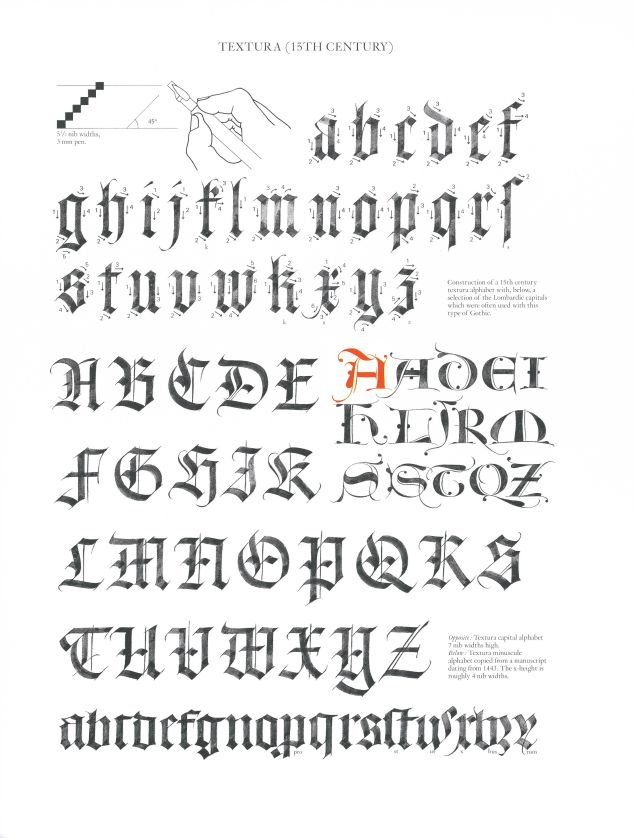
But that’s my hang-up to get past, because it’s still important to look at excellent examples of what you want to do and emulate that to the best of your ability. Over on Reddit, we’re beginning a weekly study session wherein we take a look at an exemplar alphabet and then do our best to copy it. So far this month we’ve been working off of this one, by Claude MediavillaMediavilla

The idea is to take a close look at the exemplar and see how he made each letter. You can see in the lower-case letters how there are a lot of repeated patterns, strokes that go into making more than one letter. In the upper-case this is less common, but you can still see some strokes being re-used over again.

It’s going to be hard to get these exact, but we can at least try:

Quadrata Practice 01 Quadrata Practice 2

As you can see, it got a little messy. This was my second shot at it, by the way. Not only did I learn more about Textura Quadrata, I also learned that your walnut ink doesn’t have to be thick and deep brown. In fact, it’s probably better if it isn’t. Anyway, this is a decent emulation, I think. There are hiccups – the letter s, small or large, is not my friend. And I don’t think I’ll ever use that wonky k or the long s. I did have someone call my Q “rock star,” so I have that going for me.

Since we started with this, I’ve been trying to use this variant of Quadrata as much as possible, and it’s working well for me, I think. So there you have it – study pays off. Who knew?

Do you have a favorite exemplar for your calligraphy? Share in the comments and let’s all give it a whirl!

Ink Drop for September 2015

Time again for the good old Ink Drop, thanks to our friends at Goulet Pens. This month’s theme was “Cavern Expedition”, giving us the colors of darkness and gemstones. Let’s take a look.

Ink Drop Limerick 16

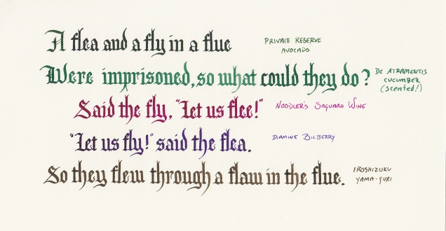
This one is a tribute to the absurdity of English spelling. As any ESL teacher can tell you, explaining the logic behind English spelling is the work of a lifetime.

Pelikan Edelstein Jade is a very nice green with a bit of blue to it. It should do all the things you need a good green ink to do, whatever those things might be. And it actually seems close to the color of jade, so who knew?

Topaz, also by P-E, is a very nice, bright blue in the ranks of Iroshizuku’s Ama-iro and Waterman’s Inspired Blue. Ask your parents, kids. Anyway, much like Jade up there, it’ll do a fine job at being blue and doing what you need blue to do.

Diamine’s Amazing Amethyst is, well, purple. And I’ve never really been in the market for a purple ink, but if you want one that doesn’t jump off the page with its purplosity and say “Lookit me! I’m purple ink!” the way some purple inks do, then this is what you want.

Diamine’s Onyx Black is impressively black, really. which is what I would want from an ink with that name. In large quantities, though, it has a distinctly purple undertone to it. Probably not something you would notice if you were just writing with it, but when it spreads out it certainly makes itself shown.

Finally, we have Faber-Castell’s Garnet Red, a good red that, much like the Amethyst above, doesn’t go out of its way to jump off the page.  It’s red, but you know not red red. Just red enough. It is secure and confident in its redness. It’s a humble and demure example of true redditude.

So there it is, the September 2015 inks. Enjoy ’em!

Ink Drop Limerick for June 2015

Honestly, I’m surprised I haven’t put this up here yet. Talk about a guaranteed blog topic…

A little backstory: Over at Goulet Pens, they have a service called the Ink Drop. Once a month for $15 ($10 if you’re in the US), they’ll ship you five samples of inks chosen from their vast, inky collection. They’re usually themed in some way, but it’s a little something to look forward to every month if you’re a fountain pen writer or a calligrapher, or someone who plays with inks in his or her own way.

Of course, you want to test them out when you get them, but how? Well, I thought that doing calligraphy with them would be a good way to do it, and with five colors every month, the most obvious vehicle for my testing would be a limerick.

Thus, the Ink Drop Limerick was born. You can see previous months’ on my DeviantArt page, but let’s go over this month’s inks together, shall we?

Ink Drop Limerick 13


Continue reading

The Magic of Pi

The duo Hard ‘n Phirm came up with a song about Pi a while ago that sang the praises of that irrational, irresistible number, and I thought I would take a shot at representing it in calligraphy.

Pi - Clean

This was a learning experience. First, if you’re going to use a light gray to write the background numbers, keep in mind that it’ll dry darker than you think. So there’s that. And writing with gouache upon gouache will require liberal applications of spray fixative in order to make it work.

I’m not sure about the fine white lines on the red – in my head they were an essential step, but in practice… I’m not sure. Still, it looks good in Real Life. Maybe I’ll donate it to the math department…

Have a very verminy Valentine’s Day!

This was actually the first quotation that came to mind when I decided to do this project.

2015-02-03 21.10.02


The H and the B came to me as I was about to fall asleep – I literally got up out of bed, grabbed a marker, and drew them out so I wouldn’t forget. The first couple of drafts of this were in italic and were bizarrely over-flourished in some deranged attempt to… to do something. I’m not sure about how I rendered the attribution, but at this point it was too late in the evening to start over. Again.