The Great Color Test 2015

I occasionally have ideas for projects that feel like they would best be done in color, but apart from a couple of forays into random black paper, I didn’t really know where to go with this. So I asked our Dear Friends over on /r/calligraphy on Reddit about their thoughts. As expected, they had experience in this and pointed me in the direction of Canson Mi-Teintes colored paper.

Now, I’m fairly used to things simply not being available here in Japan, and was wondering if I should try and find a place online to order it, when I found that my local stationery store had a whole bunch of it. So I grabbed a few colors, brought them home and went to work!

2015-05-30 21.49.46

I then mixed up a bunch of gouaches and applied them in the following order, for the sake of convenience:

  • Holbein Permanent White
  • Holbein Permanent Yellow
  • Holbein Flame Red
  • Holbein Burnt Umber
  • Holbein Emerald Green
  • Holbein Pure Blue
  • Holbein Pure Blue (lightened)
  • Windsor & Newton Brilliant Purple
  • Holbein Brilliant Silver
  • Holbein Pearl Gold
  • Holbein Ivory Black
  • Sumi ink
  • Pilot Document Ink

It took the better part of the afternoon, and most of the results weren’t too surprising if you had a basic understanding of color theory. But theory and practice are two different things, and it’s important to know how your media work together.

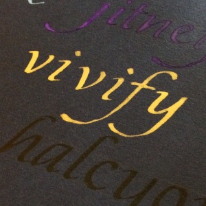
By far, my favorite combination was probably the indigo paper and the gold gouache:

2015-05-31 08.54.15

It looks nicer in person. As does the gold-on-green:

2015-05-31 08.54.50

Red-on-yellow works well, too.

2015-05-31 08.55.15

This color test was basically a way to tune into what combinations look good and what should be avoided. Burnt Umber on pretty much anything, for example, should be avoided. The full album on Imgur is here, if you want to see everything.

I’ll probably head back to the store and buy more colors at some point in the near future, and do my best to consider which calligraphy ideas might work well on colored paper. In the meantime, if you have the supplies to hand and an afternoon free, why not do your own color survey?

The Magic of Pi

The duo Hard ‘n Phirm came up with a song about Pi a while ago that sang the praises of that irrational, irresistible number, and I thought I would take a shot at representing it in calligraphy.

Pi - Clean

This was a learning experience. First, if you’re going to use a light gray to write the background numbers, keep in mind that it’ll dry darker than you think. So there’s that. And writing with gouache upon gouache will require liberal applications of spray fixative in order to make it work.

I’m not sure about the fine white lines on the red – in my head they were an essential step, but in practice… I’m not sure. Still, it looks good in Real Life. Maybe I’ll donate it to the math department…

May the Fourth Be With You!

It was Star Wars Day yesterday, so I spent my day writing out lines from the films. Most of them were by request from people on Twitter and Facebook, which was a fun way of delegating the work of research. I had a good time working out styles and colors and layouts, and even if not every little detail worked, it was a fine tribute to the movies. So here they are!

Continue reading

Pointed Pen Predicaments

Well, “predicament” sounds a bit much, but I wanted the alliteration.

In any case, I’m gingerly branching out into pointed pen after having spend a year behind the broad-edge. There are a lot of reasons for this, but mainly because I’ve seen such beautiful work done with that instrument that I’d like to one day be able to do it myself.

From Iampeth.com

My first target was Spencerian script. This is the kind of writing you would have been likely to see in business correspondence back in the early 20th century, and I like it for its spidery precision.  It’s meant to be written quickly, with a minimum of flourishing (except perhaps in the capitals). I wanted to get to know it mainly because it straddles that line between handwriting and calligraphy.

Unfortunately, it’s a real pain in the ass.

My Spencerian so far is rough and doesn’t look nearly as effortless as the various exemplars I’m seeing. Mind you, I’m a beginner – it should look awful. That doesn’t keep it from being a bit disheartening every time I look at what I want it to look like versus what it should look like. And, to be fair, I ran into this with broad-edge calligraphy as well. My italic was just a mess for a good while until I finally figured out how to make it look good. Perhaps the same will happen with Spencerian.

Spot the differences!

In the meantime, I’m going to start tinkering with Copperplate, mainly because where Spencerian is meant to be written quickly, Copperplate is slow and deliberate, and I think I have a better chance with slow and deliberate than I do with quick and dashy.

To that end, I bought Eleanor Winter’s Mastering Copperplate Calligraphy, which breaks it down into bite-sized pieces. We’ll see how that works.