I thought I’d do some practice with Roman Capitals – letterforms that form the basis of most of the Latin Alphabet that we use today. Understanding these will help improve other calligraphic scripts, especially in terms of letter proportions and spacing. So, Given that this is one of my Resolutions this year, I’ve been making time to practice. The good thing is that they are best practiced monoline – a pencil or a fine-tipped marker will do, and I have plenty of those.
So, here we go. For this exercise, I made an Abecedary of fictional companies. See if you know where they all come from…

It doesn’t look all that bad, right? Well, it could be better. It helps that I used a 5mm grid as a guidesheet underneath, which made it easier to put everything on a straight line. But there is still some wonky spacing going on in places. Not to mention, I need to make sure my straight lines are actually straight. There are some wrinkly lines in here that need to be ironed out.
Let’s look at some letters, shall we?
The letter A should, in Romans, be about 2/3 the width of their height. In this case, 1 centimeter. For this activity, I took all the As out and checked them against a 1 by 1/3 cm rectangle and…
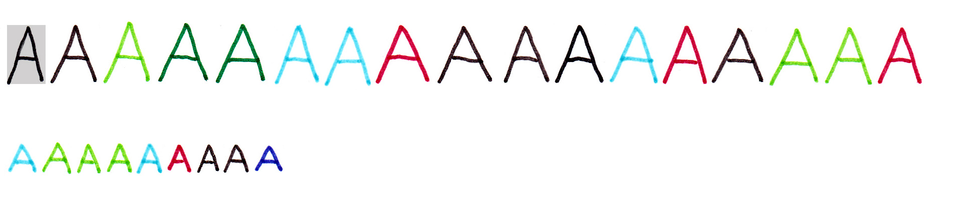
Yeah, that didn’t work so well.
How about O, which should be 1 cm by 1 cm. How’d I do?

A little better, but not great. Finally, let’s try E – which should have the width of half the height.

Again, a little better, but not nearly consistent enough. I could do this with the rest of the alphabet, but I’ll not burden you with all that. Next will have to be letter spacing, but I’m barely ready to start on that…
