The Final Ink Drop

Yup, you read that right – this is the last one. Goulet Pens announced earlier this month that they were discontinuing the Ink Drop program. Oddly enough, the main reason was because it was too popular, which doesn’t seem to make sense. So much so that I mentioned to to our business teacher as a possible case study for his students. They explained it rather well, though.

The end of the Ink Drop was a bit anticlimactic, and a lot of comments seemed to be, “But what about ME?!” I admit, it would have been nice to end with a bit more flourish (a writing joke -get it?) but it is what it is, and I’m thankful that I was able to benefit from the program for as long as I did.

That said, here’s this month’s colors! The theme is “Forest Foray”.

2016.04 Ink Drop

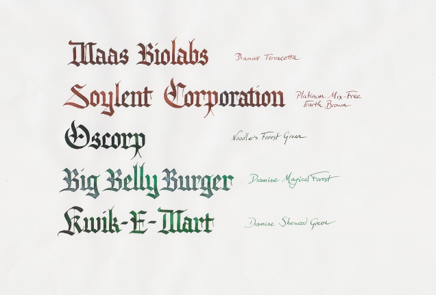
As I think I’ve mentioned before, I’m not a fan of brown fountain pen inks. Walnut ink passes muster, but not much else. Indeed, Earth Brown has a little more yellow in it than I would like, and while Terracotta is more on the red end of brown, if I wanted an orangy ink, there are a lot of others I could go with. But that’s just me – your mileage may vary.

As for the greens, They’re all good. Forest Green is dark and rich, Sherwood green is a little more obvious in its Green-ness, and Magical Forest… Well, it’s one of Diamine’s “Shimmertastic” inks, and it lives up to the label. It’s almost ostentatiously shiny.

As an aside – I don’t think I’ll ever use a Shimmertastic ink in a pen. The glittery bits settle pretty quickly, and if there’s one thing you never want to do, it’s shake a fountain pen. I’ve been getting lots of use out of them for calligraphy, though.

So there we are. That’s it for the Ink Drop, which means several things:

  1. I’ll finally be able to start running down the trillion little ink samples I have on my desk, and
  2. I’ll need to find something else to put on this blog. Damn you, Goulet, for making me actually put effort into something!

I’d like to extend my appreciation again to Goulet Pens for having provided this service, and I really can’t recommend them enough. I’ve bought from them many times – pen, paper, ink, supplies – and they will continue to be my first choice in this regard.

Now. What else to write about…?

Ink Drop for March 2016

Okay, I need to get less lazy about these, or this’ll just be an Ink Drop blog. Not that there’s anything wrong with that…

The Ink Drop from our good friends at Goulet Pens this month was “Monarch Madness,” which I’m given to understand is some kind of sports reference. That aside, however, it’s a set of five royal inks, all blues and purples that should serve you well. So let’s look at ’em!

2016.03 Ink Drop

Man, that got real feathery, didn’t it? It was done on paper meant for manga art, so maybe that doesn’t sit well with fountain pen inks. We learn a new thing every day.

Most of this is Diamine, which has been on a nice streak of inks recently. I’m going to a fountain pen show tomorrow, and will probably have my scanners set for Diamine so that I can buy more inks that I technically do not need. Huzzah!

Tyrian Purple is an interesting light purple, probably not one that I would use in an everyday fountain pen. That’s mostly because I don’t really want to write in purple, but your preferences may vary. Anyway, this is a very reddish-purple that is reminiscent of the ancient purple that got made from snails. Not a bad pedigree, so you might want to use it for that alone.

Imperial Purple is closer to what I think of as Purple – closer to blue than red, and something of the color of Grimace or grape soda. If purple ink is your thing, I’d say this is the way to go.

Of the three blues, I would use any of them in an everyday pen. Regency Blue is quite dark, but still blue enough to be classy and distinct. Majestic Blue is a little lighter, but still within the realm of respectability as a blue ink, and Noodler’s Kung Te-Cheng is the kind of faded blue that you would see on your classier type of Chinese porcelain. Any of these three will do you if you’re a blue ink writer.

So, overall a nice set of inks this month. Not sure which ones are going to get used in calligraphy – probably all of them at some point – but I do know I have to use better paper.

Thanks for stopping by!

Ink Drop for January 2016

Hello and welcome to another Ink Drop, thanks to our friends at Goulet Pens. I actually have a decision to make regarding this program – thanks to the USPS, the price of an international subscription is going up, so they’re giving a chance to opt-in to a $5 increase. The price doesn’t bother me, but it would be a chance to stem the growing tide of tiny little sample bottles that threaten to overrun my desktop… On the other hand, I would miss getting mail and doing this, so I’ll probably keep my subscription going.

Anyway, here are the inks we got in January:

2016.01 Ink Drop

As you can see, it’s a fairly muted selection this time around. They all write nicely, though – no wild feathering like last time – and there are subtle differences in the inks that take a bit of looking to detect.

De Atramentis’ Jane Austin and Edgar Allan Poe are two really, really similar green inks. Poe is a bit lighter than Austin, which is weird since Poe has never really been considered lighter than anyone. But as greens go, they’r both serviceable and gave me no trouble.

Gray Flannel is a pale, gray-blue color that might be a nice option if you’re one of those people who likes blue, but doesn’t want a BLUE-blue, like Iroshizuku’s Kon-Peki or Private Reserve’s DC Supershow or something like that. This is a blue that won’t draw too much attention to itself, which is useful at times.

The other two follow the same pattern as the cool-colored inks. De Atramentis’ William Shakespeare is a dark, wine-red ink that, like Gray Flannel, is good if you want red, but not High School English Teacher red. And J Herbin’s Cafe de Iles is a brown, almost orange color that turns out brighter than you might expect. It’s not exactly glowing, but there’s good warmth to that ink. Not sure when I’d use it, though. For calligraphy, I tend to default to walnut ink if I want a brown.

Anyway, that’s all for now. Happy writing!

Last Ink Drops of 2015

For a variety of reasons, I got behind in trying out my new Ink Drop inks. Totally my fault, and has absolutely nothing to do with my being the sole survivor of a pre-apocalyptic suburban paradise lost in the wasteland of post-nuclear Massachusetts. Nothing.

First, November:

2015.11 Ink Drop Limerick

These were some lovely inks all around. I don’t have a lot to say about each one individually because, frankly, they all work. The Kiri-Same is a nice one to have, as a good grey ink is tough to come by sometimes (unless you dilute sumi, which is a perfectly fine, if a bit trial-and-error, option), and while the Autumn Oak is a great vibrant orange for calligraphy – up there with Noodler’s Apache Sunset and Iroshizuku’s Yu-Yake – it’s probably not one I would load up a pen with. Just as a personal preference, seeing as how my words don’t feel very orange to me. Yours might, so go for it.

The limerick, by the way, came from Ranjit Bolt’s book, A Lion Was Learning to Ski, all a bunch of amusing limericks.

Now, December’s a little different….

2015.12 Ink Drop

First, you may notice that I didn’t do a limerick. That’s because, even with Ranjit Bolt’s help, I just couldn’t find any that I really wanted to write out. So I went to another resource, my growing collection of abecedaries. This one is the group of fictional companies. I alphabetized them, numbered them, went to Random.org and used whatever came out.

Now I can see what Goulet Pens is up to this month, via those clever dogs at De Atramentis – Gold, Frankincense, and Myrrh, with some red and green to round out the five. Nicely done, although at least two of these inks gave me some trouble when I first did this.

The first time I tried this, the Gold came out really heavy, so the second try required a bit of a lighter hand with the dipping. Once that was taken care of, though, it came out looking quite nice. The Brilliant Red is more pink than red, really, so I probably won’t use a lot of it. Outside of my sarcastic Valentine’s calligraphy, I don’t have much use for pink.

The biggest troublemaker here, of course, is the Frankincense. All that feathering on what is pretty smooth paper. Kind of absurd, but it might not be too bad a problem if you’re using a fountain pen – especially a finer-nibbed one. If I want to use this again, I’ll have to be a bit more careful about loading on the ink. The other De Atramentis ink, Myrrh, seemed to work just fine, and the Vibrant Green is great.

So there’s two months in one. Lucky you!

Ink Drop for October 2015

It’s time again (a little late, actually) to look at a new set of inks thanks to Goulet Pens and their Ink Drop service. This month’s selection was dark and spooky, as would be expected, so let’s take a look!

Ink Drop Limerick 17

A couple of things to note at first – the Fraktur variant is one that we’re practicing over on Reddit. It’s a bit different from the one I usually do, but it came out looking quite nice. If you’re interested, the miniscules are here, and the majuscules over here so you can try for yourself.

You’ll also note that this set of inks is very friendly for everyday use. You probably won’t get any funny looks for using these to write notes at work or mark exams or whatever you put them in your fountain pen for. So if that’s one of the metrics by which you look for inks, there you go.

Noodler’s Nightshade is a red-black ink, to the point where I’d say it’s more sepia than anything else. It shades a bit with a broad edge, but in an ordinary pen it should work just fine.

Noodler’s Heart of Darkness really does deserve the name. It’s black. It’s Joseph Conrad sailing through the untamed wilds of Africa on top of the flagship of the Haggunenon star fleet black. Really not much more I can say about it other than if you’re looking for a black ink, this one’s got you covered.

De Atreamentis Fog Grey is – much in the spirit of how Sahara Grey back in August is really green – not really all that grey. It’s blue. Sure, it’s a slate blue and a lovely one at that, but if you’re hoping to write pale, fog-like letters that seem to emerge from the mist to rest above the page, well… It’s blue.

Private Reserve, I must say, does some fine blue inks, and this one is one of them, even though it’s on the purple end of the blue spectrum. Their blues – and this is no exception – have a vivid quality to them that I like.

Finally, Waterman’s Mysterious Blue is quite nice. I’m not sure it really qualifies as “mysterious,” as there’s very little mystery about what it is. I don’t know the process for naming inks, though. Maybe the Chief Ink Namer at Waterman was binge-reading Sherlock Holmes stories when the Chief Ink Mixer dropped a bottle of the stuff on her desk and said, “Name this! Now!”

Stranger things have happened.

Anyway, to sum up – a nice selection this month, suitable for all your writing needs, whatever they may be. And as a final point, I’d like to point out that this is an original limerick, as the internet has been disappointingly bad at producing limericks of quality. Thank Grodd for rhyming dictionaries…

Ink Drop for September 2015

Time again for the good old Ink Drop, thanks to our friends at Goulet Pens. This month’s theme was “Cavern Expedition”, giving us the colors of darkness and gemstones. Let’s take a look.

Ink Drop Limerick 16

This one is a tribute to the absurdity of English spelling. As any ESL teacher can tell you, explaining the logic behind English spelling is the work of a lifetime.

Pelikan Edelstein Jade is a very nice green with a bit of blue to it. It should do all the things you need a good green ink to do, whatever those things might be. And it actually seems close to the color of jade, so who knew?

Topaz, also by P-E, is a very nice, bright blue in the ranks of Iroshizuku’s Ama-iro and Waterman’s Inspired Blue. Ask your parents, kids. Anyway, much like Jade up there, it’ll do a fine job at being blue and doing what you need blue to do.

Diamine’s Amazing Amethyst is, well, purple. And I’ve never really been in the market for a purple ink, but if you want one that doesn’t jump off the page with its purplosity and say “Lookit me! I’m purple ink!” the way some purple inks do, then this is what you want.

Diamine’s Onyx Black is impressively black, really. which is what I would want from an ink with that name. In large quantities, though, it has a distinctly purple undertone to it. Probably not something you would notice if you were just writing with it, but when it spreads out it certainly makes itself shown.

Finally, we have Faber-Castell’s Garnet Red, a good red that, much like the Amethyst above, doesn’t go out of its way to jump off the page.  It’s red, but you know not red red. Just red enough. It is secure and confident in its redness. It’s a humble and demure example of true redditude.

So there it is, the September 2015 inks. Enjoy ’em!