Hello again, all. I bet you’ve been on the edges of your seats, wondering what I’ve been putting out recently. Well relax! Unclench! The time has come to find out…
I’ve been keeping myself busy with a few found lines and some foreign languages just to mix things up. Here are a few of my favorites.
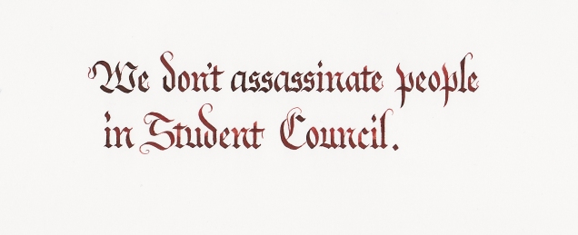
The Head Boy of our student council actually said this out loud. It made sense in context – he was talking to a history teacher about Stalin’s practices in Soviet Russia, but still… I had to write it down.
Another student of ours came across this line quite a while ago, and I resolved to write it out. I did it once before, but the result was mixed. Nice text, terrible-looking attribution. She’s about to graduate, so I thought I’d make it look nice. Bradbury is popular in our program, so it’s great to see a student appreciate him.
My very-nearly-second year lit class is reading Ovid’s “Metamorphoses” right now, and we had a couple of lessons on the story of Phaethon. Like a lot of the stories in that book, there are lessons that we still need today. In this case, be careful with dad’s car. Out of curiosity, I looked up the original Latin and decided to write it out. In Romans, of course. If it had been Biblical Latin, however, I would have used Uncial. Why? Because.
One translation of the epitaph is:
Here Phaethon lies who in the sun-god’s chariot fared.
And though greatly he failed, more greatly he dared.
It was FDR’s birthday the other day, so I thought I’d finally do the line that everyone has on their list somewhere. I like how it turned out.
However, it always reminds me of a discussion I had a while ago with a friend who hates FDR thanks to Japanese internment in World War 2. I wanted to reply with, “Yes, but…” and then I thought about it. How the hell do you “Yes, but” Japanese internment? Simple – you can’t. But I can accept that Roosevelt was flawed, and that his good parts were really good.
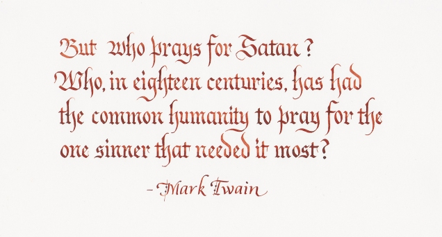
Okay, one more:
I love Mark Twain. I mean, he has a point, right? He certainly does.
Anyway, that’s a few of the things I’ve been working on. Hope you’re enjoying yourselves!
Hello and welcome to another Ink Drop, thanks to our friends at Goulet Pens. I actually have a decision to make regarding this program – thanks to the USPS, the price of an international subscription is going up, so they’re giving a chance to opt-in to a $5 increase. The price doesn’t bother me, but it would be a chance to stem the growing tide of tiny little sample bottles that threaten to overrun my desktop… On the other hand, I would miss getting mail and doing this, so I’ll probably keep my subscription going.
Anyway, here are the inks we got in January:
As you can see, it’s a fairly muted selection this time around. They all write nicely, though – no wild feathering like last time – and there are subtle differences in the inks that take a bit of looking to detect.
De Atramentis’ Jane Austin and Edgar Allan Poe are two really, really similar green inks. Poe is a bit lighter than Austin, which is weird since Poe has never really been considered lighter than anyone. But as greens go, they’r both serviceable and gave me no trouble.
Gray Flannel is a pale, gray-blue color that might be a nice option if you’re one of those people who likes blue, but doesn’t want a BLUE-blue, like Iroshizuku’s Kon-Peki or Private Reserve’s DC Supershow or something like that. This is a blue that won’t draw too much attention to itself, which is useful at times.
The other two follow the same pattern as the cool-colored inks. De Atramentis’ William Shakespeare is a dark, wine-red ink that, like Gray Flannel, is good if you want red, but not High School English Teacher red. And J Herbin’s Cafe de Iles is a brown, almost orange color that turns out brighter than you might expect. It’s not exactly glowing, but there’s good warmth to that ink. Not sure when I’d use it, though. For calligraphy, I tend to default to walnut ink if I want a brown.
Since I’m really a beginning calligrapher, and don’t feel that I’m in a position to offer any real advice or tutorials just yet, I thought one thing I could do here is just show what I’ve been working on, comment on it, and see what kind of lessons we can all learn about what we’re doing here. So this should be my new weekly post, and if I have other things to talk about, I’ll fit them in as best I can.
Anyway, my usual work pattern with calligraphy is this: I do the Words of the Day and Quotes of the Week over on /r/calligraphy on Reddit, as that gives me at least one daily task to complete. Getting even that one thing done is better than getting nothing done. After that, I hit up my personal quotation archive and my Evernote note of Things to Calligraph and see what strikes me. If the mood is right, I’ll do a longer quote, or maybe a little practice or something like that. If I’m really cruising, I’ll have a more lng-term project to work on, but those are still rare. Most of what I do is done in an evening.
Without further ado, here are a few things I worked on this week.
From the upper left: Textura Quadrata, Fraktur, Italic, Foundational, Uncial, Romans, Engrosser’s
One important realization I made this week is that I have to change how I do my Word of the Day. Up until now, I’ve been using all the scripts I have on each Word, which is… tiring. So I figured that since I have seven scripts at my disposal, I’d do one of them per day. I hope this makes things a little simpler, and allows me to focus a little more on each one instead of hopping from one to another so that I can get the Word done.
That said, this is a good word, with lots of nice ascenders to play with. If I were the playing type, which it seems I’m not. Okay, that’s going on my list of Calligraphic Resolutions – “play more.” Done.
This was a Quote of the Week over on Reddit, and I chose to do it in Foundational just so I could have more practice with it. There are things in that script I’m still working on – the exit strokes on most letters, for example. I’ve seen some variants where it comes out in a strong hook, others where that exit stroke is subtle and a little understated. I’m still toying with it, to be honest.
I think this came out well in general, though. Some of the spacing is cramped – look at “beautiful” for example. The spacing of the vertical strokes from utiful especially should be equal, but they’re not. Regularity of spacing is key to doing pretty much any script well, and is probably a constant struggle for most calligraphers.
As for the quote itself, I heartily agree. Not only does it give you a point of familiarity to base a friendship on, as all friendships need, but it provides you with a wonderful shorthand for talking to each other. A quick literary reference can communicate so much so quickly. It makes things a lot easier, all told.
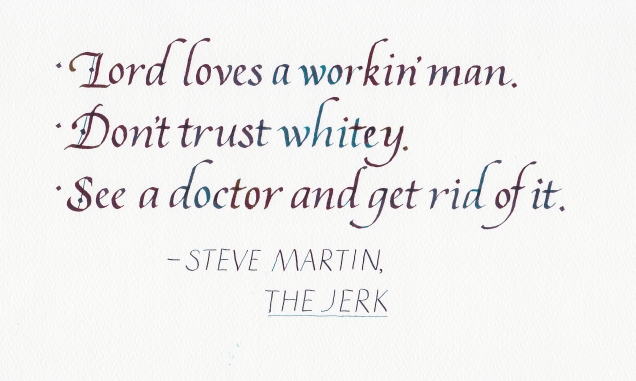
I decided to watch The Jerk again, and it’s still a wonderful movie. The humor holds up really well, which isn’t something you can say about comedies over time. The above is the advice that young Navin gets from his adopted family as he goes out to seek his destiny, and honestly there is nothing more that needs to be said. Hard work is a virtue, people in power should not be trusted, and when you have a problem you should seek help for it. Boom. That’s life right there.
As for the script itself, it suffers from the same spacing issues as the Foundational – look at that poor apostrophe in Don’t, all squeezed in there. That’s because I put it in last, and reaped the unsurprising results. I think I’m a little better in italic than foundational, but to be honest, this was a hand that tasked me for a long while. And I still don’t think it’s as good as it should be.
The ink is J. Herbin’s Emerald of Chivor, which is an amazing ink. It’s a dark green, but it has red and blue in it, so that it dries to an amazing sheen. It also sticks around on your nib like a deadbeat relative, so a little extra cleaning is necessary once you’ve used it.
Oh, I’m so, so sorry you had to read this. I am, however, keeping this poem in my back pocket in case any of my lit students start to get cocky.
Once again, this was in foundational so that I could get more practice, because more practice is better. And while the spacing isn’t too bad in this one, it was a tough piece to finish, mainly because of the ink – De Atramentis Sahara Grey (which is green, dammit!) Over the course of the piece, the ink got harder to control – it felt slippery as I wrote, which probably means that the nib needed to be cleaned off fairly regularly as I wrote. I’ve seen this in a few fountain pen inks, actually, where they start off really nicely but get slippery and weird as you go. So that’s something to be aware of if you’re using fountain pen ink.
For practice I usually use either sumi ink or walnut ink that has been reconstituted from crystals. They behave much nicer, but from time to time I want color. Now I could use gouache, and I often have, but preparing and cleaning it up just feels like work.
So yeah, I’m lazy. That’s the takeaway here.
As you may or may not know, Twitch – a popular live gaming site – recently opened up a creative channel where people can basically host their own creative programs. They launched it by running the full series of Bob Ross’ “The Joy of Painting,” and the internet’s reaction was amazing. Earnestness and non-ironic passion are usually not popular on the irony-saturated internet, but I’ll be damned if the net doesn’t love Bob Ross. The response was so powerful that Twitch has decided to run a full season of the show every Monday night.
Why should this soft-spoken painter be so popular? Probably because he wanted people to enjoy creating something, and to find pleasure in the sheer act of making. Even if their paintings were never going to sell for a ton of money or hang in a museum, they could still look at it and say, “I did that. First there was no thing, then there was a thing, and I made it real.” That’s a powerful feeling, and it’s part of why I do calligraphy – in only a few minutes, and with a little patience and practice, I can make a Thing where there was no Thing.
So thanks, Bob.
This is done in the aforementioned walnut ink, which usually behaves very nicely, and in the Vespesian Uncial script. My uncial used to be different – closer to foundational, actually – until I found this variant. Now I do this.
It’s tougher, with that zero-degree pen angle, but the look is really nice when done well. I had to invent a w because there was none in the source document, and I still can’t get the proper n to look right. But I still like it.
And the sentiment is great as well. As a high school teacher, the problem of how students deal with each other is a big one, and one that can have life or death repercussions. There are always going to be those students who think that the best way to make themselves look good is to tear others down, and I hope we do everything we can to show them that’s not how civilized people behave. This one aphorism isn’t going to solve the problem, but it might help take the sting away a little.
That’s this week’s work. Any feedback or thoughts? Put ’em in the comments!