I’ve been playing with gouaches and colors this week, and the quotes I’ve chosen to do seem to call out for the use of Roman Capitals. Because, clearly, I need to punish myself for my sins.
The thing about Romans is that there are fairly strict proportional rules to the letterforms and the spacing between letters, and they can be tough to master. Only through repeated practice and analysis can you get them right, and that can take quite a while. So I may as well enjoy it while I can.

This is from the Garbage song “Push it,” and while I do think these are the nicest Romans I’ve done in a while, the N is off-model. There shouldn’t be serifs on the pointy bits, which goes for pretty much any other letter with pointy bits on.

This line comes from Kentucky Fried Movie, a wonderful film that is far funnier than you expect. I love this line, and Romans seemed to be the way to go. Centering aside, it’s not bad. The real problem with it, though, is that it’s wobbly. Look at ELEVEN – the vertical lines are all over the place there, and that’s true throughout. The differences in the three appearances of A suggest that I need to spend more time practicing instead of working on whole pieces. That said…
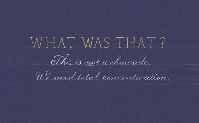
This is another one of my favorite lines – out of many – from Kentucky Fried Movie. I did this first in walnut on white, but I thought I could make it look better with gouache. Now, a few things happened here. For one, I discovered that gouache doesn’t always behave the way you want it to, which is most evident in the Copperplate. I had to think out the white quite a bit before my pen would write with it.
As for the Romans, the same issues are in play – proportions, balance, and straight lines all need work. The two Ws definitely could be a lot more even. In addition, if I’m going to do serifs, they should look more intentional, rather than the result of a strong jolt from a car battery while holding the pen.

I did this after Fallout 4 was announced. The gold on red is gorgeous, and some aspects of this look better. The shading was done with a 2B pencil, and that makes the letters stand out, but still… I thought about wiping out the guidelines in PhotoShop, but wanted to keep them there to remind myself of why they’re there. Look at the C – it doesn’t come close to the upper guideline.
So yeah, Romans are a challenge, but they’re useful. More time and more practice, and eventually I’ll have them to a level where I don’t flinch as soon as I look at them.


