One phrase that I keep seeing used in regards to learning calligraphy is “Study as much as you practice.” To be honest, that’s tough for me. One of the things I enjoy about doing calligraphy is making something – having a pretty thing exist where there wasn’t a pretty thing before, and frankly a few pages of repeated letters and practice strokes doesn’t scratch that itch.
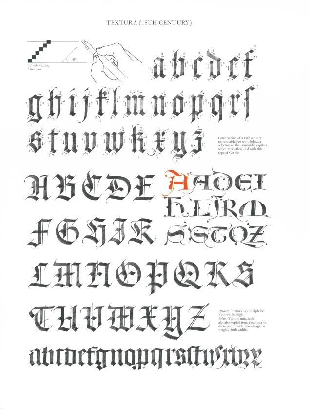
But that’s my hang-up to get past, because it’s still important to look at excellent examples of what you want to do and emulate that to the best of your ability. Over on Reddit, we’re beginning a weekly study session wherein we take a look at an exemplar alphabet and then do our best to copy it. So far this month we’ve been working off of this one, by Claude Mediavilla
The idea is to take a close look at the exemplar and see how he made each letter. You can see in the lower-case letters how there are a lot of repeated patterns, strokes that go into making more than one letter. In the upper-case this is less common, but you can still see some strokes being re-used over again.
It’s going to be hard to get these exact, but we can at least try:
As you can see, it got a little messy. This was my second shot at it, by the way. Not only did I learn more about Textura Quadrata, I also learned that your walnut ink doesn’t have to be thick and deep brown. In fact, it’s probably better if it isn’t. Anyway, this is a decent emulation, I think. There are hiccups – the letter s, small or large, is not my friend. And I don’t think I’ll ever use that wonky k or the long s. I did have someone call my Q “rock star,” so I have that going for me.
Since we started with this, I’ve been trying to use this variant of Quadrata as much as possible, and it’s working well for me, I think. So there you have it – study pays off. Who knew?
Do you have a favorite exemplar for your calligraphy? Share in the comments and let’s all give it a whirl!

